Blue or Purple? The Nine-Dot Illusion That Has the Internet Divided Over Color

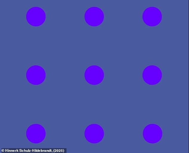
Nine bold purple dots sit on a plain, dark purple (bluish) background. The question is simple but divisive: are the dots blue or purple? On Reddit, the debate has racked up thousands of upvotes and hundreds of comments, with readers trading lines like "definitely violet" and "they're all purple." The illusion was designed by Dr. Hinnerk Schulz-Hildebrandt of Harvard Medical School as a test of where our attention lands. This tiny pattern has sparked a global argument about what we actually see.
In This Article:
How It Works: Only the Center Dot Appears Purple
The nine dots are all, in reality, purple and placed on a bluish background. The trick is that only the dot you’re directly gazing at should appear purple. If you hold your phone about 30 cm from your face and look at each dot in turn, the dot at the center of your focus should appear purple while the others fade toward blue. As the inventor explains, a pattern of purple objects on a blueish background appears only purple where the viewer looks directly at it. In the periphery, the perception shifts toward blue. Our brains construct purple when a mixture of light-sensing cells in the eye is activated, and purple is particularly sensitive to background colors, especially in peripheral vision.
More Variations: 360 Dots and a Vanishing Poem
In another version, 360 purple dots are placed on the same blueish background. By holding your phone about 10 cm from your face and slowly moving it away, you should see more dots change from blue to purple as your area of focus expands. In a final version, Schulz-Hildenbrandt created a “vanishing poem” using text in the same purple-and-blue combination. Holding the phone close to your face and reading carefully, you should see the word you are currently reading turn purple while the rest of the text becomes blue and fades into the background.
Why Purple Isn’t a Wavelength: How the Brain Creates Color
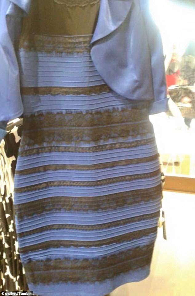
Purple isn’t tied to a single wavelength of light. It is generated in the visual cortex when a combination of L-cones (red) and S-cones (blue) are activated. This makes purple a fragile and unstable perception, easily influenced by psychological factors or surrounding context. The same color-contrast effect that explains why The Dress appears black and blue to some and purple and gold to others is at work here. Because cone distribution differs across the retina, purple is easier to see in the center of vision than in the periphery, which helps explain why the dot you’re looking at seems truly purple while others appear blue.
What These Illusions Reveal About Perception
The Delboeuf illusion shows how context changes our sense of size: a dot surrounded by a large ring often looks smaller than an identical dot surrounded by a small ring. In food psychology, a related idea used to be that smaller plates trick people into feeling fuller, while larger plates do the opposite. Yet new research suggests hunger can sharpen analytic processing, allowing people to identify portions more accurately regardless of presentation. Taken together, these findings remind us that perception is constructive: our brains interpret color, size, and even portion sizes through context and focus.